
Looking to Benchmark Pay?
Graphing
Often in salary analysis, you will find that as one variable changes, so does another. For example, you may find that an organization's executive salaries vary according to its revenue levels, or that employee performance varies based upon experience level.
Graphing is a useful way to visualize these relationships.
Here are some tips for preparing graphs:
- First tabulate all your data.
- Then determine which variable you will show along the x-axis (the horizontal axis) of the graph and which along the y-axis (vertical axis). Typically, the x-axis is used for the independent variable, and the y-axis is used for the dependent variable, which responds to the independent variable. For example, if you find that performance level responds to experience, you will plot experience along the x-axis and performance along the y-axis.
- Set the limits of the graph (minimum and maximum values). You don't need to use zero as the value for the lower-left-hand corner of the graph. If you are making multiple graphs, it can be helpful to use the same minimum and maximum for comparison purposes.
- Set divisions based upon easy-to-read whole numbers. For example, you may want to set salary-level divisions $5,000 apart on the x-axis of a graph.
Straight-line equations
Once you plot your data on the graph, you can then look for patterns. The simplest way to describe a pattern is through a mathematical straight-line equation. This will let you calculate the dependent variable given any independent variable (or vice versa).
The equation of a straight line is:
y = mx + b
Where:
- m is the slope of a line in relation to the x-axis
- b is the y-intercept (where the line hits the y-axis when x is equal to zero)
Slope
The slope (m) tells you how hard it would be to run up the straight line, i.e. how steep it is.
The larger "m" is, the steeper the slope.
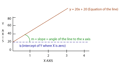
A line with an upward slanting slope shows a positive relationship between the variable on the x-axis and the variable on the y-axis. Conversely, a line with a downward slanting slope shows a negative relationship between the x variable and the y variable.
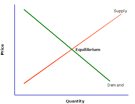
Example: In the graph above, the supply line shows a positive relationship between price and quantity. The slope of the supply line shows that as price increases, the quantity supplied also goes up. The reason being that companies will produce more of a product when the price increases.
The demand line, on the other hand, is negatively sloped. This means that as price goes up, the quantity demanded goes down. The reason for this is consumers tend to buy less of a good as its price goes up. The point where the demand and supply lines intersect is the equilibrium point. It is the point at which the quantity demanded equals the quantity supplied.
Calculating the slope. There are an infinite number of lines with the same slope, and there are an infinite number of lines with the same y-intercept. But there is only one line that can be drawn using the same slope AND the same y-intercept.
In order to calculate the slope of a line, you need to know just two points on that line: (x1,y1) and (x2,y2). You then find the slope by determining how much the line rises, divided by how much the line goes over.
Slope = (y2 - y1) / (x2 - x1)
Example: Two points on a straight line are (2,4) and (8,12). You can calculate the slope of the line as follows:
Slope = (12 - 4) / (8 - 2)
Slope = 8/6
Slope = 1.3
To find the intercept, plug this slope into an equation for this line using known values for x and y.
y = mx + b
4 = 1.3 (2) + b
4 = 2.6 + b
b = 1.4
y = 1.3 (x) + 1.4