
Looking to Benchmark Pay?
Presenting Salary Survey Data
There are several ways to tabulate and present compensation data:
- Job Title
- Frequency Distribution
- Graphs
- Maturity Curves
How you decide to tabulate and present data all depends on the purpose of your survey.
Job Title
In most surveys, data is presented separately for each job, and each job is usually assigned a job code. The table is an example.
| Section: | Administrative |
|---|---|
| Job Group: | CLERICAL/ADMINISTRATIVE |
| Job Title: | Department Secretary |
| Job Code: | 135 |
| Job Description: | Responsible for performing secretarial duties within a specific department, usually reporting to a department director. High school and two years clerical experience required. |
| Pay Type | Industry | Location | # Companies | # Incumbents | Mean | 25th Percentile | 50th Percentile | 75th Percentile |
| Base Pay | ||||||||
| Short-Term Incentive | ||||||||
| Total Cash Compensation |
Frequency Distributions
Somewhat less common is a frequency distribution that presents the total number of incumbents at each pay rate or class for each job. The Bureau of Labor Statistics uses this method in some of its surveys. Example below.
Wage-Rate Frequency Distribution
| Job: Electronics Assembler-Repetitive | |
|---|---|
| $ PER HOUR | NUMBER OF EMPLOYEES |
| 7.30 and under 7.50 | 66 |
| 7.50 and under 7.70 | 72 |
| 7.70 and under 7.90 | 94 |
| 7.90 and under 8.10 | 198 |
| 8.10 and under 8.30 | 201 |
| 8.30 and under 8.50 | 450 |
| 8.50 and under 8.70 | 268 |
| 8.70 and under 8.90 | 118 |
| 8.90 and under 9.10 | 79 |
| 9.10 and under 9.30 | 39 |
Advantage
The advantage of using a wage rate frequency distribution is that it presents sufficient detail to permit the user to calculate several summary measures.
Disadvantage
The disadvantage is that a wage rate frequency distribution does not identify specific company data such as size and type of organization.
Other information, such as hiring rates or ranges, can be tabulated in a similar way using a frequency distribution.
Graphs
If the major purpose of the survey is to compare job structures rather than individual jobs, graphs may be used. In this approach, a graph depicts a summary pay line made up by consolidating information in the survey and a company salary line.
Advantage
The advantage of using a graph is that each organization can compare its salary level and structure with the summary results of all organizations and with each organization, individually.
Disadvantage
The disadvantage is that it is necessary to average the data to make the graph.
Constructing such graphs is enhanced when the participating organizations are using the same job-evaluation plan. But the method does not depend upon this. Any consistent method of plotting the jobs on the horizontal axis will suffice.
Maturity curves
Maturity curves represent a picture of progress in an occupation. This is a well-known approach, typically used in salary surveys of professional employees.
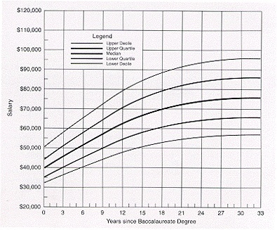
Professional associations may collect and publish salary data by scholarly discipline, degree level, supervisory status, and years since degree. Such data is presented as frequency distributions of number of individuals at each salary level for each year since obtaining the degree.
Separate distributions are provided for the different degree levels, and for supervisors and non-supervisors. Some graphs of this data designate years since the degree as the horizontal axis and monthly salary as the vertical axis, and plot several computed measures (medians, quartiles, trends); hence the term maturity curve.
Policy and practice data
Many variations are also possible in the tabulation of compensation policy and practice data. They may be presented in narrative form, or they may be tabulated question by question following the questionnaire outline used.
Many surveys do report survey submission separately, however, but most present policy and practice data in summary form.
Memory Jogger
When tabulating salary survey data, it is best to use: