Chapter 5: Quantitative Methods Used In Human Resources
AUDIT AND CONTROL STATISTICS
Break-Even Analyses
The point of volume of sales where the revenue after variable costs can cover the fixed costs is the "break-even point." At the break-even point, profit equals zero.
The break-even point is best illustrated graphically:
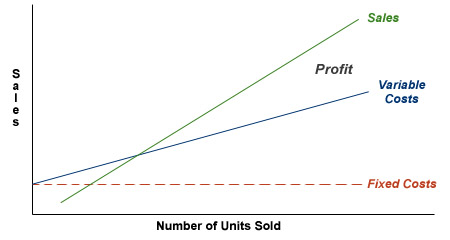
Fixed costs are expenses that do not vary with volume of sales. On the contrary, variable costs change when sales volume changes.
Break-even volume can be expressed mathematically as:
Break-even volume = Fixed costs / (Price - Variable costs per unit)
Break-Even example
You decide to produce and write a traditional textbook covering compensation administration. There are 25,000 members belonging to HR World of which 15,000 are practicing compensation professionals. You conclude that 10% of these compensation professionals will be interested in your textbook and they can be reached through an email campaign. Your costs in producing this textbook include:
- time: 1/2 year at 3 hours per day (assume that your time is worth $20/hr)
- printing and production costs: $9.55 per book
- development and digital campaign costs to advertise your textbook: $1.50 per email
- supplies and overhead: $1,000
Revenue per textbook: $35.00
How many textbooks must you sell to break even?
Break-even solution
Fixed costs:
- time: 300 days at 3 hours per day (assume that your time is worth $20/hr)
- supplies and overhead: $1,000
- development of digital campaign costs to advertise your textbook: $1.50 per email
Variable costs:
- printing and production costs: $9.55 per book
Revenue per textbook: $35.00
| Fixed Costs | ||
|---|---|---|
| Category | Unit Cost | Total Cost |
| Time |
$20/hr 3 hrs/day for 300 days |
300 days x 3 hrs/day x $20/hr = $18,000 |
| Supplies and Overhead | $1,000 | $1,000 |
| Advertising |
Development: $0.50/email Digital Campaign: $1.00/email 15,000 flyers |
$0.50 x 15,000 = $7,500 $1.00 x 15,000 = $15,000 |
| TOTAL | $41,500 | |
| Variable Costs | |
|---|---|
| Category | Cost |
| Printing and Production | $9.95/book |
Break-even volume = Fixed costs / (Price - Variable costs per unit)
Break-even volume = $41,500 / ($35 - $9.95)
Break-even volume = $41,500 / $25.05
Break-even volume = 1,657
Compa-ratios
Compa-ratios are a percentage representation of a company's pay levels as they compare either to the company's own structure or to competitive levels. In the simplest form, a company paying $90,000 for a position whose structure or competitive level is $100,000 would have a compa-ratio of 9/10 or 90%. In other words, the market or compa-ratio is determined by dividing the company's level by the competitive structure:
Compa-ratio = Company Level / Competitive Structure
It is a term used in salary administration regarding employees. For example, "He's making $90,000 and his comp ratio is 90%." It can also be appropriately applied to departments, companies, and other comparison situations.
For example:
| Position in Dept. A | Salary ($)* | Competative Level ($)* | Compa-Ratio (%) |
|---|---|---|---|
| Secretary | 30,000 | 18,000 | 167 |
| Communications Coordinator | 40,000 | 20,000 | 200 |
| Research Analyst | 55,000 | 55,000 | 100 |
| Marketing Analyst | 40,000 | 38,000 | 105 |
| Marketing Manager | 75,000 | 75,000 | 100 |
| TOTAL | 240,000 | 206,000 | 120 |
*The numbers are used for illustration purposes only.
Remember, it is not the sum of each individual compa- or market-ratio divided by the number of positions.
Compa-ratio example
A company pays salaries that average 90% of competitive rates. Competitive rates are reflected through position standards, all of which form the comparison salary structure.Since competitive forecasts are for 10%, both the structure and the annualized salary increase are 10%. What will the company's compa-ratio be at the end of next year?
Compa-ratio solution
Next Year's compa-ratio will be:
Compa-ratio = Present Salaries / Competitive Salaries
Compa-ratio = (Present Salary x 1.1) / (Competitive Salary x 1.1)
Compa-ratio = Present Salaries / Competitive Salary
The compa-ratio is unchanged.
In another example, the "competitive average for a position is $30,000." A company utilizes benchmark ranking evaluations and chooses to pay 10% below the market:
Position Value = $27,000
Individual in Position earns $23,000
Compa-ratio = $23,000 / $27,000 = 85%
Cost-Benefit Analysis
Cost-benefit analyses produce a ratio that plots a company's cost against the real benefit received by an employee. For example, a company pays $12.00 in salary but has a real cost of $6.00 (without consideration of benefit and retirement liabilities). The individual receiving that $12.00 may be receiving only $8.40 in real value (if in the 30% tax bracket).
In this case: where company cost is a real $6.00 and employee benefit is a real $8.40, the result is a $6.00 : $8.40 comparison or a cost-benefit ratio of 1:1.4. Differing cost benefit ratios exist for different elements of compensation. This is particularly true in the case of perquisites. The real value can be determined by the nature of the benefit, the company's tax status and the employee's own tax status.
The goal in business, particularly in human resource practice, is to be more "cost efficient." Hence, a 1:1.5 or 1:2 ratio is sought, especially for compensation dollars. The formula for cost-benefit determination is expressed in the following equation:
Cost-Benefit = Company Cost / Net Benefit Received by Employee
Cost-benefit example
An automobile lease cost is $5,400 to a company (at fleet rates), which is approximately $960 less than what an individual could negotiate. Gas is $1,200; maintenance is $840; insurance and licenses is $1,920 (although the company qualifies for group rates and can get insurance for as low as $1,400). With an individual in the 30% tax bracket and the company in a 40% tax bracket, what is the cost benefit of having the automobile supplied by the company rather than having it leased by the employee?
Note: In the employee annual cost column, assume that the employee gets reimbursed for the entire amount spent on gas and maintenance. However, the employee would have to pay for the car lease and insurance with after-tax dollars.
Cost/benefit solution
| Expense | Company Annual Cost ($) | Employee Annual Cost ($) | Basis for Discount |
|---|---|---|---|
| Lease Payment | 5,400 | 6,360 | Fleet Rate |
| Insurance Premium | 1,400 | 960 | Group Rate |
| Gas and Maintenance | 2,040 | 0 | |
| TOTAL | 8,840 | 8,280 | |
| Taxes (40% corporate)* | (8,840 x 0.40 = 3,536) | 8,280 x 0.30 = 2,484 | |
| NET COST (After Taxes) |
5,304 | 10,746 |
*The organization saves this money, since it does not have to pay taxes on $8,840 in revenue that it in turn spends on what some may believe to be employee compensation (definitions change by country and individual circumstance).
Cost-Benefit Ratio = Company Cost : Employee Cost
5,304 : 10,764
1 : 2.03
Guidechart Formation
Salary increase guidecharts (or matrices) are designed to plot out acceptable levels of salary increases based on an individual's:
- performance
- salary position within a range (the compa-ratio)
Budgeted salary increases are usually determined by top management and will generally range between 2% and 5% depending on organization performance and external market conditions.
In constructing a guide chart, it is essential that the increase salary budget percentage be placed at the midpoint of the data on the two scales, at the:
- point of the average benchmark or market rate
- AND
- company's comp ratio for the coming midyear date
To do this, one plots the average product of percentages in a matrix format of:
Performance Distribution x Range Distribution x Increase Percentage
(A1 Count) x (B1 Count) x (C)
OR
Average Product of Percentages = SA1/SAall x SB1/ SBall x C
Remember: S is called sigma. It signifies an operation (similar to addition or subtraction) which may be expressed as: "the sum of." In the above example, the sum of Performance Ratings = Performance Rating 1 + Performance Rating 2 + Performance Rating 3...for as many values as you have.
Sigma takes precedence as an operation.
Guidechart formation example
A company has a market ratio of 50% of its employees in the bottom 1/4 of the range and the rest evenly distributed. It utilizes a performance appraisal technique where 1/3 of all employees are higher performers; 2/3 are average; and 0% are unsatisfactory. It wishes to increase salaries on the average of 7% for the coming year, almost twice the expected competitive increase amount. In preparing a guidechart that has a horizontal axis of range position and a vertical axis showing appraisal scale, where would a human resource administrator position the "average" guideline percentage?
Guidechart formation solution
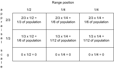
Then change these to percentages by multiplying them with the percent increases:
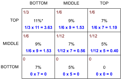
*Percentages can be chosen arbitrarily and then tested.
3.63 + 1.53 + 1.19 + 1.53 + 0.56 + 0.40 = 8.84%
8.84% would be too high for a 7% budget; hence, management must "fine tune" this chart to fit with controls and organizational philosophy.
Special note to users: Always check interval date variances and salary level variances. For example, higher paid performers, better performers.)
Salary Increases
By definition, a salary increase is the amount of additional dollars to be paid to an individual within a given time period. It is not, in itself, the extra dollars; rather, it is a promise to pay additional dollars.
Administrators often confuse matters by disregarding the differences between annualized and budgeted salary increases. "Budgeted Costs" relate to a definite plan of expending additional real dollars. "Annual salary increases" refer to the total percentage actually granted.
The only time when annualized and budgeted percentages are the same is when all increases are granted at the first of the year.
Salary increase example
A company budgeted that it will grant an average 6% merit increase on January 1 and a 3% general salary on July 1. In actuality, the company granted a 5% merit increase on January 1 and a 3% general salary increase on April 1. What is the annualized salary increase percentage for the year?
Salary increase solution
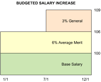
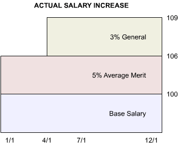
Budgeted Salary Increase: 6% merit + 3% (1/2 year) + 3% of 6% merit increase (1/2 year)
Budgeted Salary Increase: 6% + 3% (1/2 year) + (0.03 x 6%) (1/2 year)
Budgeted Salary Increase: 6% + (3% + 0.18%) (1/2 year)
Budgeted Salary Increase: 6% + 1.59%
Budgeted Salary Increase: 7.59%
Actual Salary Increase: 5% + 3% (3/4 year) + 3% of 5% merit increase (3/4 year)
Actual Salary Increase: 5% + 3% (3/4 year) + (0.03 x 5%) (3/4 year)
Actual Salary Increase: 5% + (3% + 0.15%) (3/4 year)
Actual Salary Increase: 5% + 2.36%
Actual Salary Increase: 7.36%
The actual salary increase is less than the budgeted salary increase; therefore, this company came in under budget in its salary increases for this year. The timing of the increases determine the actual spend for the year.
Structure Formation
Each year, most companies review adjustments to their salary structures. Many use salary survey data to aid in determining the need for changes in the structure. For example, a regression analysis of salary survey results might show average benchmark positions (as defined in a company's grade range approach) as earning:
| Grade | Present Structure ($) | Competative Levels ($) |
|---|---|---|
| 1 | 20,000 | 22,400 |
| 2 | 24,000 | 26,000 |
| 3 | 28,800 | 31,600 |
| 4 | 34,600 | 39,000 |
From the data, you may wish to adopt the following structure:
| Grade | New Structure ($) |
|---|---|
| 1 | 22,000 |
| 2 | 26,400 |
| 3 | 31,600 |
| 4 | 38,000 |
Structure formation example
A present salary structure is quantified as:
11 + $4,000
It is based on a point factor job evaluation plan. At the bottom of the exempt structure (800 points) you find salaries are increasing at 7%, and at the top (7,000) you believe salaries are increasing at a 10% rate. What would be your new structure for the coming year, assuming you match these rates?
Structure formation solution
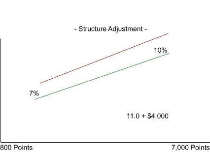
We need to know two equations to create a new structure.
The first is the equation for a line given as: y = mx + b
In our example, y = salary, m = the slope of the line, x = the structure points, and b = the y intercept.
The current salary structure is given as 11 + $4,000. In our equation, 11 = m, the slope, and $4,000 = b, the y intercept.
We also need to know the equation for finding the slope of a line:

To find the present low and high salary values given the current structure, we plug the x values (structure points) into the first equation (we need two points having x and y values to draw a line):
low salary = 11 x 800 points + $4,000 = $12,800
high salary = 11 x 7,000 points + $4,000 = $81,000
Now we can calculate the low and high salaries adjusted for the increases.
new low salary: $12,800 + (0.07 x $12,800) = $13,696
new high salary: $81,000 + (0.10 x $81,000) = $89,100
To find the new slope (m) we can take the new salaries (y values) and plug them into the second equation along with the structure high and low points (x values):
| Slope | = | $89,100 - $13,696 |
| 7,000 - 800 |
The slope or m = 12.162
Finally, we need to find the new y intercept or b. We could use either the high or low salary and in this example we will use the new high salary and plug it into the first equation and solve for b.
$89,100 = 12.162(7000) + b
b = $89,100 – 85,134
b = 3,966
New structure is 12.162 + 3,966
New Salary = 12.162 x structure points + 3,966
You are now ready to develop a new structure.
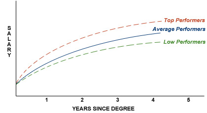
Maturity Curves
Maturity or career curves are descriptive techniques often used in professional, sales or engineering environments. They plot salary (y-axis) against years of work or years since degree (x-axis).
As reporting devices for salary surveys, maturity curves allow a grouping similar to grading (or they can be used with grades) to define the average expected rate of pay. Their underlying importance in salary surveys is that "time on the job" has a great impact on pay. When one talks about "average pay" there is an implied understanding of the "average tenure" in that position for all incumbents. (One would expect an inexperienced individual to be in the bottom of the salary range; more experienced employees would be at the top.)
Should one conduct a salary survey and sample only senior or only recently hired employees, the results are likely to be erroneous.
Maturity curve example
Construct a maturity curve from the following data:
| Years of Experiences | Average Salary ($)* |
|---|---|
| 0 | 12,000 |
| 5 | 20,000 |
| 10 | 26,000 |
| 15 | 30,000 |
| 20 | 28,000 |
| 25 | 26,000 |
Are there any concerns that might be shown with such a curve?
Maturity curve solution
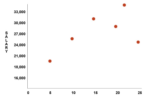
Yes, because constructing a downward sloping curve could very well result in discrimination against older workers who are protected by federal legislation.
Benchmarks
Benchmarks are a standard by which one can compare other observations as being below, above or comparable to the selected benchmark observations.
In human resources, we are usually dealing with benchmark jobs that statistically represent modes (i.e., where largest numbers of observations are made). That is, these jobs are those that occur most frequently, and hence, are easiest to use in salary surveys to find comparisons.
Often, one will hear the term benchmark ranking. This refers to the process of selecting positions that occur most frequently and spacing them based on median or mean salaries reported in salary surveys. Other positions not reported by salary surveys are then ranked (slotted) among these benchmarks on an ordinal scale.
For example (in a small manufacturing company):
| Benchmark Positions | Average Salary ($)* |
|---|---|
| Chief Executive Officer | 200,000 |
| Chief Financial Officer | 150,000 |
| Vice President, Sales | 148,000 |
| Vice President, Manufacturing | 140,000 |
A non-surveyed position earning $146,000 (for instance, a Vice President of Administration) would be "slotted" between the Vice President of Sales and the Vice President of Manufacturing.
Benchmark example
You are about to conduct a customized salary survey of competitive pay practices for a company that has the following positions:
| Position | Number In Position |
|---|---|
| Clerk | 20 |
| Secretary | 15 |
| Wine Tasting Specialist | 1 |
| Company President | 1 |
Of the four mentioned, which positions would you probably choose to serve as benchmarks?
Benchmark solution
Both "Clerks" and "Secretaries" have a high frequency count and therefore, would most likely be chosen as benchmark positions. However, one would probably also wish to include "Company President," since interest always exists in this position.
Cost of Living
Cost of living refers to a measure of the cost of goods and services purchased by consumers. All employees are consumers. Most often, cost of living information is expressed in terms of an index or a percentage compared against the cost of some previous period. The most common cost-of-living indexes do this, establishing a base period for comparison and using the dollar value of that time to establish present costs.
An index might show that a standard of living in various cities required an income for:
| National | $32,472 |
|---|---|
| Chicago | $33,122 |
| Los Angeles | $33,900 |
| New York | $38,332 |
Cost-of-living example
Using the above data for three cities and the national average, calculate a cost-of-living index based on the national value as 100.
Cost-of-living solution
- Chicago is $33.122 to the national average of $32,472
- Los Angeles is $33,900 to the national average of $32,472
- New York is $38,332 to the national average of $32,472
| Index | Area | |
|---|---|---|
| $33,122 / $32,472 = 1.02 | 102 | Chicago |
| $33,900 / $32,472 = 1.04 | 104 | Los Angeles |
| $38,332 / $32,472 = 1.16 | 116 | New York |
Demand and Supply
No review of human resource statistics, particularly as related to cost of living, would be complete without noting the law of supply and demand.
A supply curve is defined as price (y-axis) versus quantity (x-axis), and it traditionally slopes upward. As the price of a good increases, the quantity available most usually increases because suppliers (e.g., potential workers) more readily put the goods on the market.
Contrarily, the demand curve traditionally is explained by a decrease in quantity desired as price goes up.
The intersection of demand and supply is, in economic terms, "the market price" of the item.
In a free market economy, it is the demand and supply curves of jobs and employees that create the salary levels of a market. "Cost of living" may have no bearing on the price of labor (for example, in Dallas, cost of living is low but wages are high because the laws of demand and supply are at work).
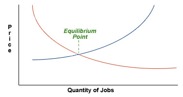
An understanding of the mechanics of supply and demand is essential to effective human resource administration.
Demand and supply example
Suppose the above graph reflected demand for and supply of unskilled labor, and the intersection of the curves was at $7.25 an hour. What would happen to the curves if the minimum wage is increased to $7.35 per hour?
Demand and supply solution
A new equilibrium point set by the government will force a "supply shift." That is, numbers of jobs available will probably decrease.
Geographic Differentials
Salary surveys often reflect supply and demand economics by reporting different levels of salaries for similar jobs compared by differing geographic areas. An area, for instance, can be said to be 10% above another area for a particular job family and 5% below the same area for another job family.
While most salary surveys do not calculate differences for different job structures or job families, it is important to note this difference both in determining salaries and, if used, cost-of-living adjustments. For example, an area such as Jerome, Idaho may have low salaries for wage earner levels but will have to pay higher than average rates for computer programmers in order to attract that particular group of workers. Geographic differences are best explained either by job-by-job comparisons or structure comparisons; single percentages are much less useful.
Geographic differential example
The national average structure for nonexempt jobs might be:
Salary = 1.0 x National Salary + 0
While in New York:
Salary = 1.18 x National Salary + $1,880
Estimate the salary in New York for a position paying on a national basis at:
- $100,000
- OR
- $40,000
Geographic differential solution
Assuming all employees receive $20,000/year salaries.
For a position paying $100,000 on a national basis, New York's salary is:
$1,880 + 1.18 x National Salary
$1,880 + 1.18 x $100,000
$1,880 + $118,000 = $119,880
New York's index is:
($119,880 / $100,000) x 100 = 119.88 or 19.88% above national average.
For a position paying $40,000 on a national basis, New York's salary is:
$1,880 + 1.18 x National Salary
$1,880 + 1.18 x $40,000
$1,880 + $47,200 = $49,080
New York's index is:
($49,080 / $40,000) x 100 = 122.7 or 22.7% above national average
Note: The percentage is not constant.
Indexes of Costs
Cost-of-living statistics have already been reviewed. Indexes of costs usually refer to living costs; however, in compensation administration they also are used to determine foreign or expatriate compensation problems.
| City | Index |
|---|---|
| Washington, D.C. | 140 |
| London | 138 |
| Paris | 163 |
Using Washington, D.C. as the base city, one would determine spending differences with the formula:
Cost-f-Living Allowance = Spendable income x [(index - 140) / 140]
Assuming that spendable income in Washington, D.C. is $10,000, the cost of living allowance in Paris is:
Cost-of-Living Allowance = Spendable income x [(163 - 140) / 140]
Cost-of-Living Allowance = Spendable income x 0.16
Cost-of-Living Allowance = 16% of spendable income
Cost-of-Living Allowance = 0.16 x $10,000 = $1,643
Indexes of costs example
Your company is located in Lincoln, Nebraska, and you are about to calculate an allowance for an individual to be transferred from Lincoln, Nebraska to Paris, France. Washington, D.C. costs are 5% above national average and Lincoln's costs are 12% below. What would the allowance be for this individual's move from Lincoln, Nebraska to Paris, France?
Indexes of costs solution
Lincoln is 12% below the U.S. average, therefore:
Lincoln = 1 - 0.12 = 0.88 of U.S. average
If Lincoln is used as a base city, it is then assigned a 100.
U.S. = 100 / 0.88 = 113.64 of Lincoln
Recall from the above table that Washington, D.C. has an index of 140.
| City | Index |
|---|---|
| Washington, D.C. | 140 |
| London | 138 |
| Paris | 163 |
We can now use the Lincoln index of 113.64 to find the index of Washington and then use that index to find the cost-of-living allowance for the transferee from Lincoln, Nebraska to Paris, France.
- Washington = 105% of U.S. national average
- OR
- 1.05 x 113.64 = 119.32 of Lincoln, Nebraska
Paris = (163 / 140) x 119.32 = 138.92 of Lincoln, Nebraska
Cost-of-living allowance for a transferee from Lincoln, Nebraska to Paris, France is 138.92/100 - 100 = 38.92 more income needed.
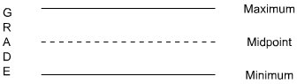
Grades and Ranges
Grades are a descriptive "ranking of jobs" into fewer groupings than number of jobs present. They allow for a transition from the job evaluation model to one that permits assignment of monetary values. Usually, each grade will provide a range of pay with a minimum, a midpoint and a maximum. Ranges will vary from 20 to 50 percent around the midpoint. (Note, the term "range" as used here is not a statistical range; it denotes a calculated spread based on the value of the midpoint.)
Grades will vary in number as will numbers of steps within a grade. Normally, the grade's midpoints increase at a set percentage, such as 10%. Grades represent the statistical technique known as blocking of error. This procedure is designed to smooth variances. Generally, the greater the number of grades in an organization, the greater its confidence in its evaluation system; the fewer the grades, the higher the degree of blocking and the lower the level of confidence
Maximum/minimum
The bottom of an artificial range is referred to as the minimum of the range. The top is the maximum. Neither relates to the maximum or minimum salary as often found in surveys. Both should exist for salary cost control purposes.
Grades and ranges example
Your company has only three positions:
| Position | Salary ($)* |
|---|---|
| Clerk | 20,000 |
| Controller | 40,000 |
| CEO | 100,000 |
With this information, construct a grade system and define the ranges.
Grades and ranges solution
There is no correct or incorrect way to design grades and ranges. Spreads between midpoints range from 6-15%; spreads between minimums and maximums may vary from 20-80%. Such spreads are defined as (maximum minus minimum) divided by minimum. That is:
(Maximum - Minimum) / Minimum
Quartiles
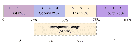
The first and third quartiles denote the outer limits of the middle 50% of salaries reported. While quartiles are straightforward divisions, care must still be taken when using them, since the term "range" is so loosely applied.
For example, a major salary survey states that a salary range is "the established minimum and maximum weekly salaries (structural ranges) reported for a position." Others refer to the interquartile range, while still others use the statistical term referring to both the smallest and largest values in a population.
In setting salary ranges, the interquartile range is most often used.
Quartiles example
Determine the range, quartiles, mean, median and mode of the following numbers:
1 1 2 3 4 4 5 6 7 9 9 9
Quartiles solution
Ranges and quartiles:
Interquartile range : 3 - 7
Mean:
(1 + 1 + 2 + 3 + 4 + 4 + 5 + 6 + 7 + 9 + 9 + 9) / 12 = 5
Mode: 9
Median: 4*
*Following the rule that one only rounds up on uneven counts.
Industry Pay Differentials
Different industries have different pay practices. Industry differences in pay practices always need to be assessed in analyzing salary data. For example, similar positions may have the following differences in pay according to their industry:
| Percentage of National Average | Industry |
|---|---|
| +20% |
Pharmaceuticals Petroleum Diversified Companies Aircraft Software/Technology |
| +10% |
Airlines Electrical Equipment Chemicals Average Building Products Household Appliances |
| -10% |
Machinery & Equipment Office Machines Paper Food Products |
| -20% |
Retail Trade Utilities Meat Products |
Industry pay differentials example
A controller in a petrochemical company earns $180,000*. For a similar position in a meat packing company, what difference in pay should she expect?
*The number is used for illustration purposes only.
Industry pay differentials solution
Petroleum = +20% of national average
Meat Products = -20% of national average
Let National Salary = N
N (1 + 0.20) = $180,000
1.2 x N = $180,000
N = $180,000 / 1.2
N = $150,000
The same position in a Meat Products industry is 20% less than the national salary.
$150,000 x 0.2 = $30,000
$150,000 - $30,000 = $120,000
A controller in a meat packing company can expect to earn $120,000.
Internet Based Benefits & Compensation Administration
Thomas J. Atchison
David W. Belcher
David J. Thomsen
ERI Economic Research Institute
Copyright © 2000 -
Library of Congress Cataloging-in-Publication Data
HF5549.5.C67B45 1987 658.3'2 86-25494 ISBN 0-13-154790-9
Previously published under the title of Wage and Salary Administration.
The framework for this text was originally copyrighted in 1987, 1974, 1962, and 1955 by Prentice-Hall, Inc. All rights were acquired by ERI in 2000 via reverted rights from the Belcher Scholarship Foundation and Thomas Atchison.
All rights reserved. No part of this text may be reproduced for sale, in any form or by any means, without permission in writing from ERI Economic Research Institute. Students may download and print chapters, graphs, and case studies from this text via an Internet browser for their personal use.
Printed in the United States of America
10 9 8 7 6 5 4 3 2 1
ISBN 0-13-154790-9 01


The ERI Distance Learning Center is registered with the National Association of State Boards of Accountancy (NASBA) as a sponsor of continuing professional education on the National Registry of CPE Sponsors. State boards of accountancy have final authority on the acceptance of individual courses for CPE credit. Complaints regarding registered sponsors may be submitted to the National Registry of CPE Sponsors through its website: www.learningmarket.org.